Diversified Design Systems and Leadership
Diversified. Design Leadership
I managed a team of 16 developers and designers. We worked on many software integration projects for clients of all sizes. Often we would be asked to take their existing brand standards and create a new collaboration workspace experience for them. These were usually for touch screen and mobile devices, both in room and remotely controlled.
Skills used: Client management, creative direction, design thinking, prototyping, wireframes, mockups and implementation.
UX and Software Delivery Projects included:
Custom work with Coca-Cola on their Investor Relations space and executive floor including integrating complex video, video conferencing, timing, recording and automated sensor systems that aligned with their brand experience.
Daimler Mercedes-Benz Atlanta Headquarters: Creation of a custom user experience compatible with Cisco UC (conferencing / control panels) involving over 100 different rooms and UC units to deploy custom screens to.
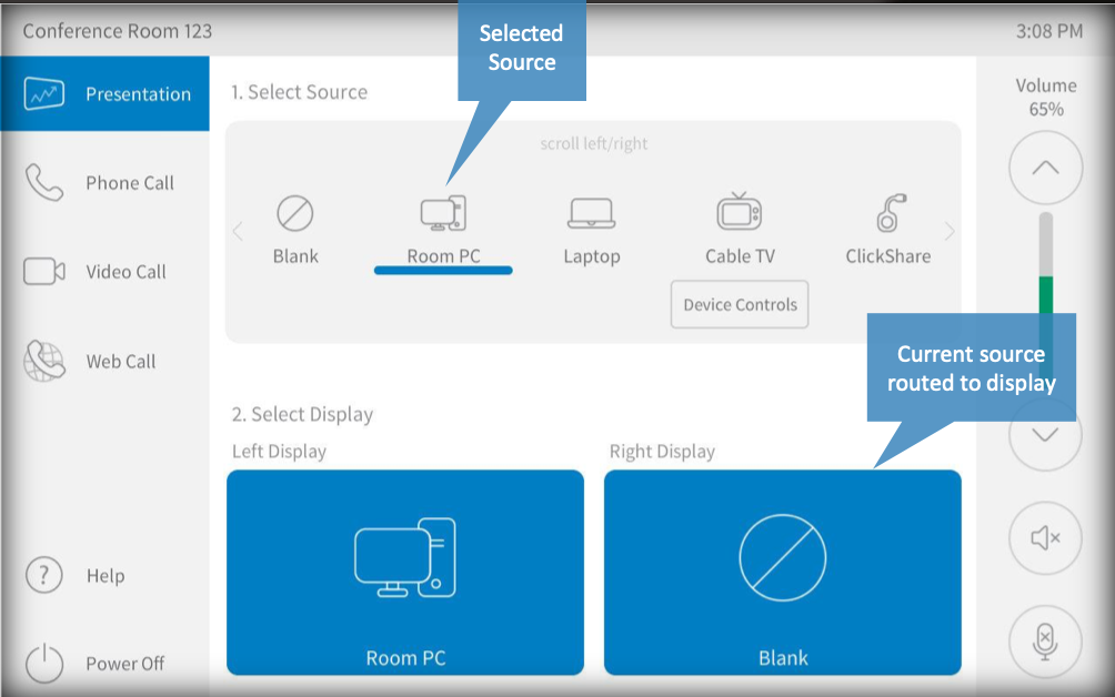
User Experience & Design Standards Initiative

Platforms/Format: Scalable from smaller phone sizes (7″) to larger tablets and walls (1060px and higher)
The design system hub included access to design assets, HTML 5, CSS, interactive template site (internal) & style guide / usage materials (PDF)
Here a examples of the light theme and dark theme versions for one larger tablet size: Light Theme Dark Theme
Style Guide / Design System How To (pdf)
Contributions / Role: Strategic direction leading to cost savings of 60% via launch of UX/UI design standards/systems initiative. Influenced adoption across internal company and clients. The design system and templates were created in collaboration with engineers, programmers, and designers along with clients and sales leadership. Championed adoption by the company and clients for software integration products and as part of our SaaS offering.
Overview of Scalable interface:
Careful thought and testing went into the why, how and where to location different features on the screens. Usability, size of the platform, and key functionality were all considered.

Custom icons created for the design system
Here are a few of the key icons created for this system. In the past, developers and designers tended to create as projects came up, leading to a mishmash of icons that often did not scale well or were not reusable for use in software products and projects leading to a lot of wasted time.

Buttons
Buttons were created to be scalable and used to clearly show status and purpose. Usability for the color blind was also taken into account when planning the design of the icons and the buttons.
