Non-Profit Gallery Tour Check In App
I’m currently working on a tour check in app for a non-profit gallery/arts organization, Arts Alliance of Georgia. This group of local artists hosts events for the Atlanta community in partnership with other local organizations.
Contribution/Role: I’m designing a prototype of the app based on what I know of the organization needs as a volunteer and co-founder. Using the product development life cycle of Brainstorm, Define, Design, Test and Launch, I’m building on paper, then in Figma in the first two phases.
Problem/Goal: Create a design for a non-profit gallery so they can have a safer, low contact way to check in visitors.
Brainstorming
I started by brainstorming ideas about what a tour check in app might need to have by using post it notes to explore different scenarios and think about the user.
Define
Next I narrowed ideas down to a minimum viable low-fi paper prototype. I decided just to focus on the check-in feature, since that would be the easiest to implement to start. I created a rough paper prototype. After reflection, I realized I went too into ideas for a checkout form that would not be viable for the first phase of the app. I decided to create a simpler version that did not require a paid checkout. The form also needed to have as few fields a possible and be quick to fill out. If a paper form was easier, the only advantage to this would be the low contact aspect.
Design
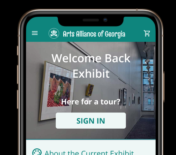
Before I began creating screens for the app, I put together a design systems page to capture typography, colors, icons and other assets. This will help me take a holistic, system driven approach and make it easier to spot inconsistencies across the app. I used components on the buttons, form fields and other areas to help with this.
I chose colors that matched the non-profit brand while paying attention to color contrast and accessibility for color blindness. I set up the heading levels and other text to show hierarchy so users could easily orient themselves in the app. I wanted to icons to be simple and familiar to the user and scalable in case I need to implement the app on mobile or desktop.
Next iteration, I want to add text to speech and text size options.

While creating the tour sign in page, I remembered a great feature on the site of a gallery I visited in Arizona. When I registered, I was given a unique confirmation code. I decided that using the code would make sign in a lot easier. A user could even past the code from a text message.
I created a mockup in Figma for the menu, home, tour sign in and confirmation screens. I added an error feature. Looking back, I need to go back and add in the criterial for what is an error for each field.
I had to make adjustments once I built the prototype, played it and realized I had forgotten about the apple notch. Whoops!

I used the mockup to create a connected prototype.
Next steps
I’ve shared this first round with a few others in the design community for their feedback. Once I do another round of edits, I’ll set up testing for usability and accessibility with the organization volunteers and a sample of users.